Web Accessibility: At the Heart of a More Human Web
Why Make Your Website Accessible?
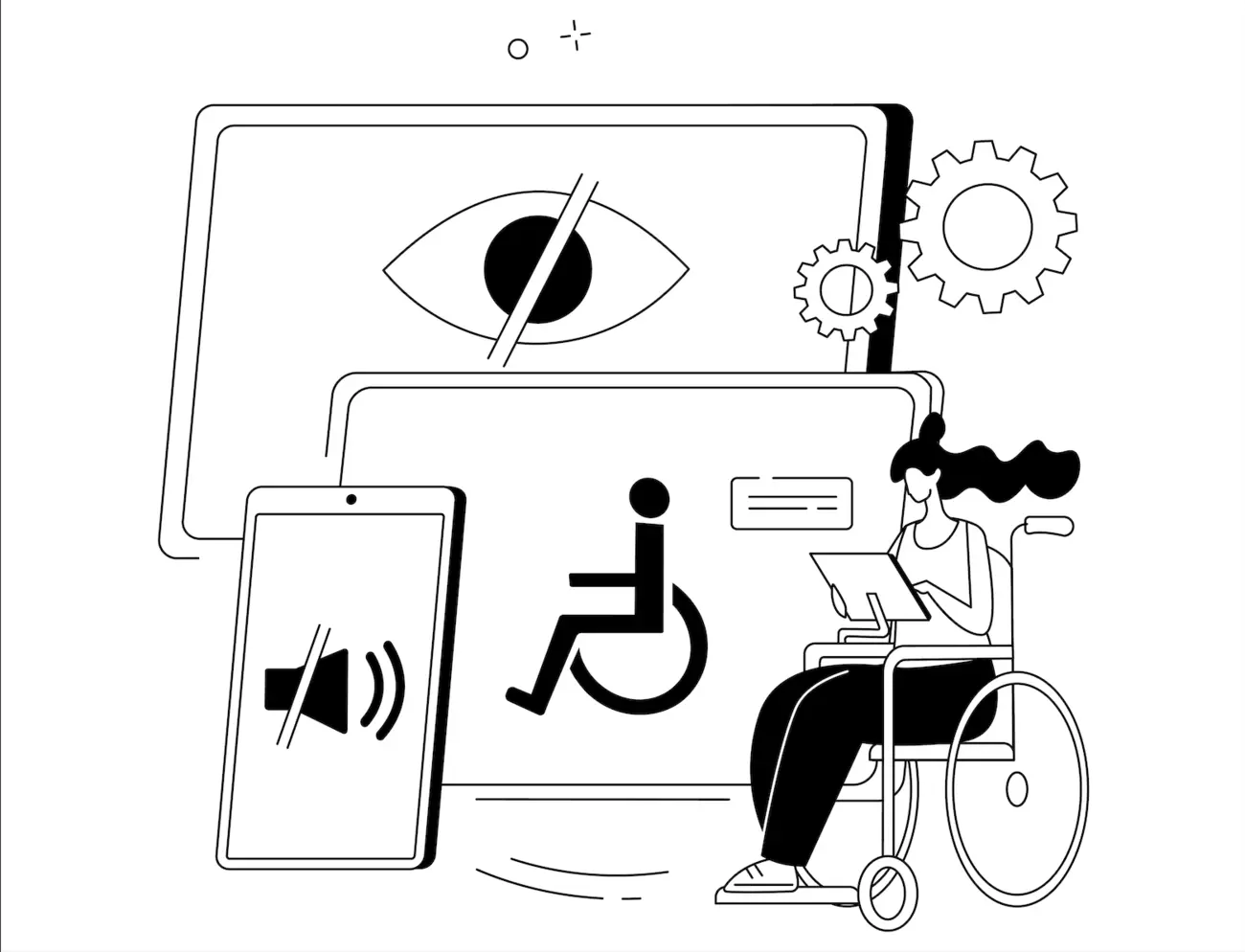
When people hear about web accessibility, they often think of those who are blind. But accessibility goes far beyond that. In Quebec and across Canada, a large part of the population lives with some kind of functional limitation, visual, auditory, motor, or cognitive. And as our population ages, even more people benefit from a well-designed web: clear navigation, readable text, and calm, stable pages that don’t move or flash for no reason.
Accessibility isn’t just a box to tick. It’s about building a web that works for everyone, in every situation.
Accessibility Isn’t an Afterthought
Too often, accessibility only comes up after a site has gone live, an audit is done, a few issues get fixed, and then it’s forgotten. But accessibility should never be an afterthought. It needs to be part of the process from day one, built right into the design and development phases.
During the design stage, it’s worth asking questions like:
- Is the contrast between text and background strong enough?
- Does the content stay readable if someone zooms the text to 200%?
- Can animations be turned off, or are they overwhelming?
- Is the site easy to navigate using only a keyboard?
The earlier you build these habits into your process, the easier and cheaper it is to keep your site accessible, and the better the experience is for everyone.
Code: The Heart of Accessibility
Accessibility isn’t just a design issue, it’s also (and often mainly) about how the code is written. Poorly structured code can make a site impossible to use with assistive technologies like screen readers.
A few key practices to keep in mind:
- Use proper semantic HTML. Tags like <header>, <nav>, <main>, and <footer> help browsers and assistive tools understand your site’s structure.
-
Use relative units (
rem,em,%) instead of fixed pixels, so your layout adjusts to user preferences and zoom levels. - Keep strong color contrast between text and background, it’s not just about looks, it’s about legibility.
- Add meaningful alternative text to images, especially when they communicate important information.
These may sound like small technical details, but they make a world of difference for thousands of people, and they make your site more flexible overall.
The Limits of Automated Tools
Built-in browser checkers and accessibility extensions can flag a few things, like low contrast, missing alt text, or vague links, but they’ll never catch everything.
A tool can’t tell if a form is confusing, if a button is poorly placed, or if an image description actually makes sense. That’s why real testing with real people is essential, ideally with users who have different abilities and assistive needs.
Accessibility “Widgets”: A False Good Idea
You’ve probably seen those little accessibility buttons that let visitors change text size or switch contrast modes. The idea sounds nice, but in reality, these widgets often do more harm than good.
They don’t fix underlying issues, and they can actually interfere with the tools people already rely on, like screen readers or built-in zoom settings. Accessibility shouldn’t depend on a plugin, it should be baked into your site from the start.
True accessibility isn’t an add-on; it’s part of good design and good development.
In Conclusion
An accessible website is better built, more sustainable, and more inclusive. It’s also a genuine act of openness and respect for human diversity, not just for people with disabilities, but for everyone: older adults, tired users, people browsing on their phones, or anyone who simply appreciates clarity and comfort.
Accessibility is what makes the web truly human.
— Claudine Langlois, Front-End Developer at Carbonia
Sources and Further Reading: